How we pulled off our personal project Tulasara.
Clover & Crow has worked with a number of skincare companies in the past, but most of them had us sign NDA’s (non-disclosure agreements) which resulted in us not being able to post the work on our website or social media. Now, whether you decide to work with a company that requires you to sign an NDA is very much a personal choice. We were more than happy to partner with these brands because they were companies that aligned with our own ethos and spoke to the kind of social and environmental responsibility that’s important to us as a business and as people. But…the flip was not being able to show it off.
Over the past 6 months, we’ve had quite a few skincare companies reach out to us for services. And naturally they ask to see our portfolio and examples of work related to their industry. And there’s the rub. We can’t.
So if we wanted to work with more skincare companies (which we totally love!) then we needed to bridge this gap. And so tulasāra organic skincare was born. But how did we actually pull it off?
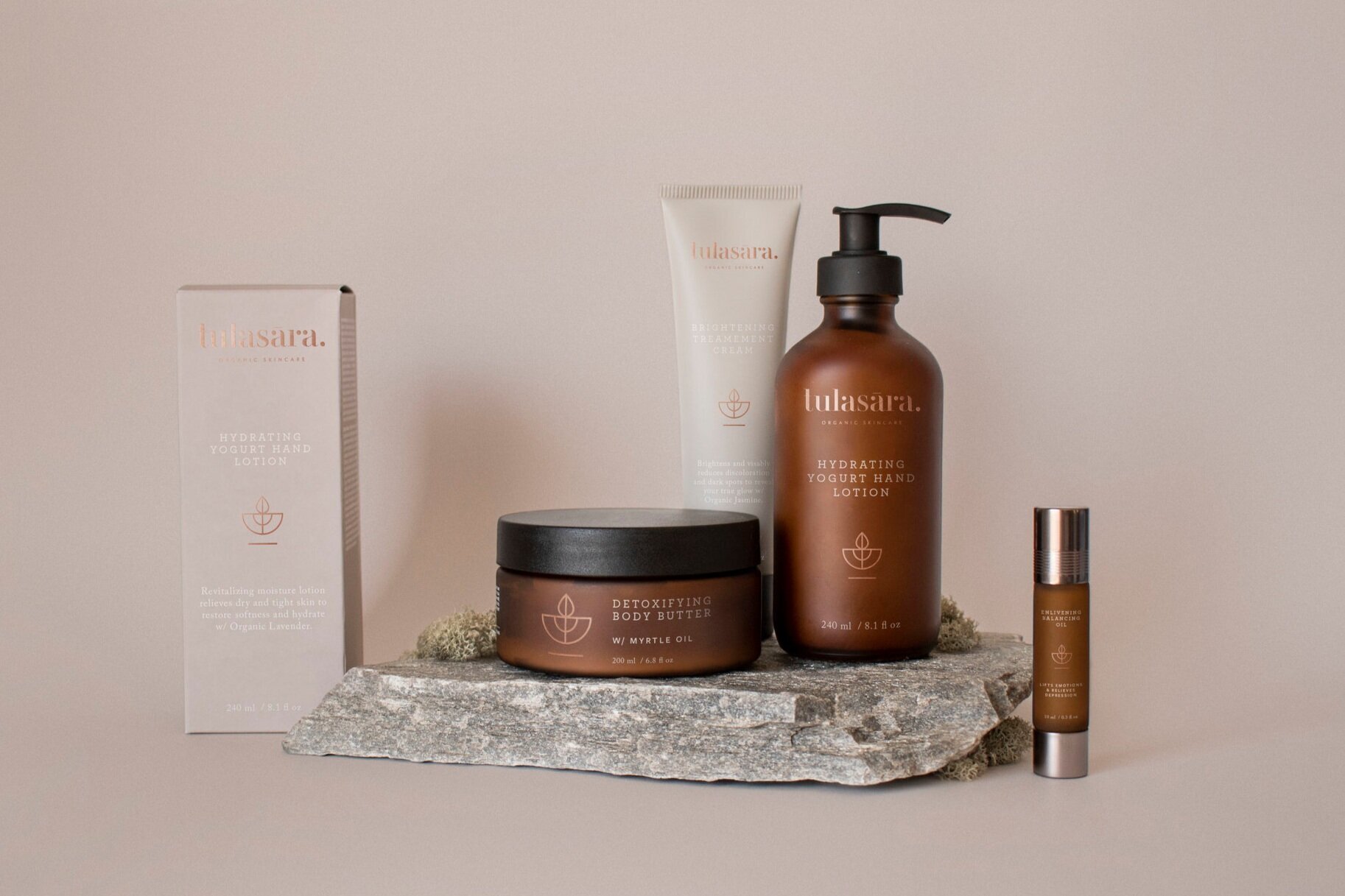
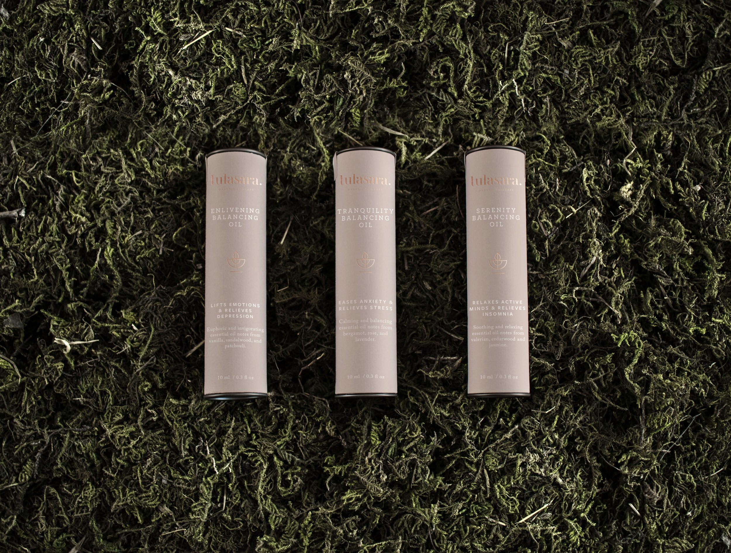
I began the process by asking myself some key questions. Who is this company? What kind of things are important to this company? Who would this company attract? What type of products would this company produce? Basically, all questions that we determine and research in the brand strategy phase of our brand packages and ask in the client questionnaire. After some digging and research, I knew I wanted to create a brand that would be socially and environmentally responsible with their sourcing and packaging and I knew these things would be incredibly important to the company, almost the building blocks to their mission/mantra from what all other things would grow. I knew that we wanted to appeal to a mainly female market, in an age range anywhere from 25-50. And I wanted to create products that had a purpose, targeting specific needs like an intense hydrating yogurt moisturizer, a brightening cream that restores youthful radiance, a body butter that detoxifies and exfoliates and lastly aromatherapy oils that help reduce stress, insomnia and relieve depression. I gathered inspiration from brands I know and love and researched ingredients I would want to source.
Once the research part was completed, it was time to find a name. With everything I knew about the who of this company, instinctually I knew I would want to draw from the ancient healing traditions of Ayurveda which utilizes the power of plant derivates and organic ingredients. I was instantly inspired by the name tulasāra which means moving towards balance in Sanskrit. While I was working at Verde as a hairstylist, Aveda launched the tulasāra skincare line and at the time and I remember being incredibly inspired and connected with the name’s meaning, perhaps because in part it’s a beautiful name, but also because I’m a Libra and balance in my life is something I’m always trying to achieve.
Once the name and the why was solidified, I jumped into creating the mood board and color palette. Drawing from wanting an earthy, natural but refined and modern brand, I created a mood board that showcased strong typography, soft but prominent branded elements and an overall feeling of sophistication and elegance. I added a copper foil to enhance the luxury of the brand paired with a muted and feminine color palette. I was basically aiming for a brand that while new, would instantly connect with our target market, but also establish trust and brand loyalty.
The next step was to begin the designing process! I started working with the primary logo, and I knew I needed a mark to go with. I went with lowercase letters because I feel like it softens the look and added a period at the end because it brings a sense of stability to the brand. I loved the shape of the period with the type so much, I altered the “r” and “a’s” to have the same size circle to carry more balance in the design. I gave the “t” the same shape as the “l” and brought the “l” down to the same height as the “t”. Finally, I added the macron over the “a” and the tagline at the bottom.
When designing the mark (as has been with everything thus far) it needed to have meaning. I brought the concept of using botanical ingredients by creating a simple leaf shape and tied it into a half moon scale depiction. I brought the two together with the macron for balance (of course) and the mark was born!
Once all the design elements were created, it was time translate the brand onto packaging. Now, I could have easily sourced mockups online (which is honestly what we do most of the time) but I really wanted to showcase what we could do so I went all out and purchased products with packaging that were aligned with the type of look and feel I would source myself given if this was an actual brand. From there I needed props, so I purchased a white paper backdrop, stones from a landscaping company, moss and wood from a nursery and rented a camera. Then it was time to shoot!
I propped up the paper backdrop on top of my side cabinet in the dining room (which luckily is right by a massive window) and just had fun! I spent the day shooting different positions of the products, trying different props and I was so incredibly happy with the results. But the most work was yet to come.
Once I had the pics (took about 400 to be exact), I needed to make them actually look like my products. So I fired up Photoshop and spent the next 2 days editing.
Now, I could just keep telling you how I edited all the pics to look exactly like a real product shoot, but that wouldn’t really be as much fun as showing you! So, I screenshot the entire process from start to finish with one of my favourite shots so if you’re curious how I did it, feel free to watch the vid below!
Once I was finished editing and all the imagery was completed, all I had to do next was to add the work to my portfolio and launch everything on social media! And within that first week we had skincare companies reaching out to us for work.
I will honestly say that this was an incredible amount of work. If I was to breakdown the time investment, I’d probably be looking at about 150 hours from start to finish, with the shoot taking up about half of that (which includes all the sourcing of props, renting the camera, retuning the camera, buying the products, editing, etc.) I dragged this out over the course of a month and completed it in my evenings and weekends because we were fully booked at the time. But all that being said, it was incredibly worth it, and I am so, so proud of what we created.
Click HERE to view the finished project!
~
Cheers,
Amy


